Raising The Stakes
Starting the new year Midland States Bank wanted to explore a fresh new look that not only complimented the existing brand but expanded upon it. Taking an overly complex and somewhat inconsistent brand this new look brings together the brand in a consistent and simplified direction.
Interactive Kiosk
With an update coming to the Midland branches soon, we explored the concept of including an interactive section in the branches. This kiosk would include a sign-in section where customers coming into the bank can safely and privately sign-in to talk to an accountant about their finances. After the customer is done signing in they can use the same kiosk as a learning center, this will allow the customer to educate themselves about the different features Midland has to offer.
Advertising / Signage
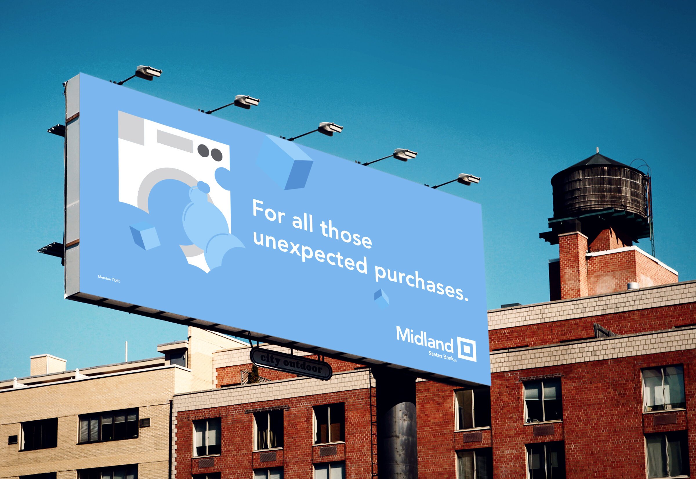
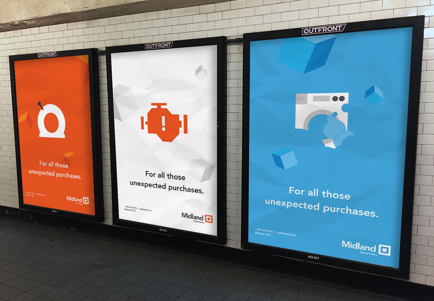
With this new creative direction in mind, a series of new and exciting advertising campaigns were designed to not only catch the attention of viewers but have a sense of humor as well.
Iconography
With a new set of icons that complement the existing Midland brand, the geometric angles that are present within the current logo are made apparent here. This consistent illustration system was designed to be used for print, digital, and everything in between.
The Team
Art Director — Tyler Leiweke